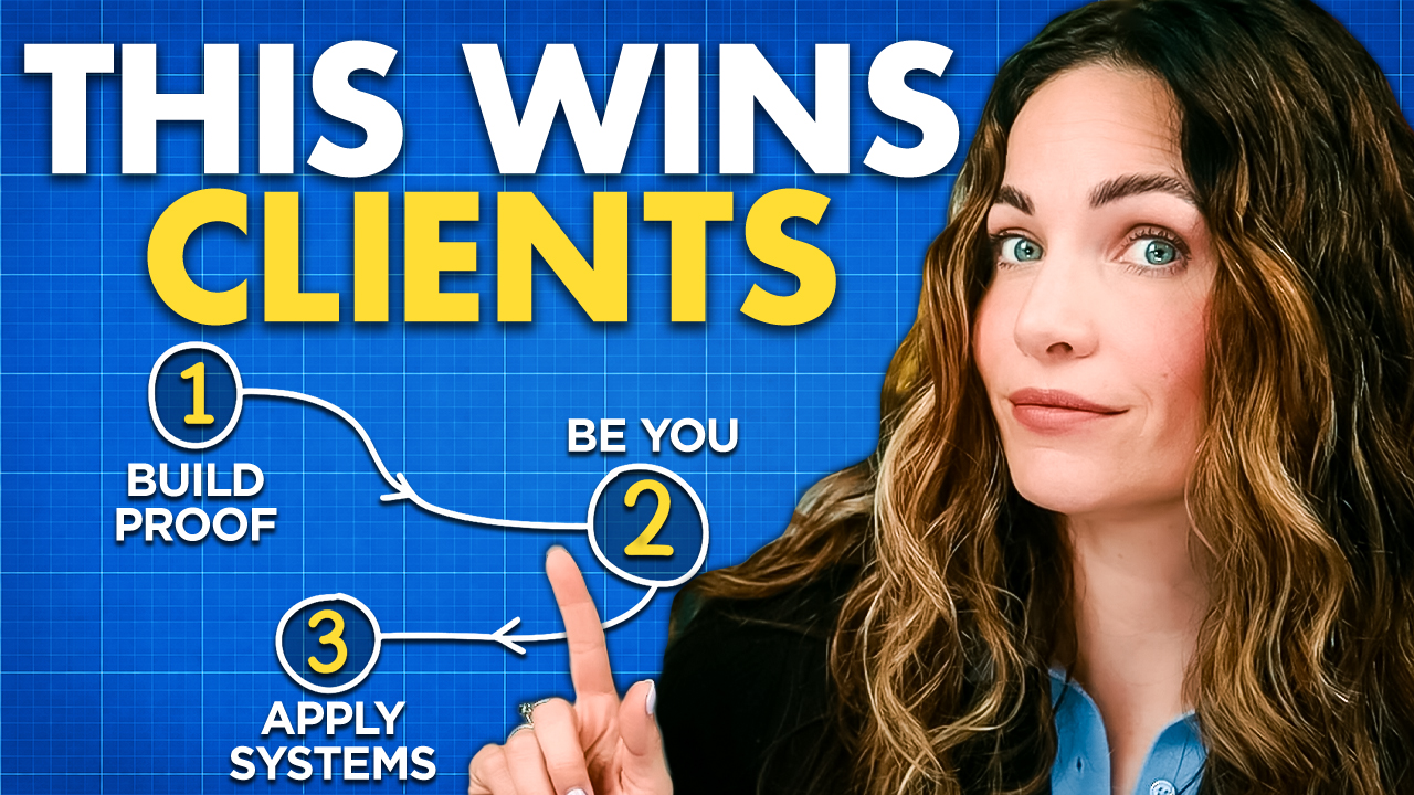
There are 5 things a high-converting landing page MUST have.
The bad news is that without these things, chances are VERY good that you’re not only seeing low conversions… but also LOSING money.
The good news? All of these conversion boosters are incredibly simple…
A few small changes here…
A little tweak there…
And you could be looking at conversion rates like 75, 85 and even 87 percent… I’ll show you how.
Hey, Posse! What’s up? It’s Alex.
Coming at ya this week to help you master the world of online marketing and messaging…
Whether you’re trying to grow your email list, write better copy, or create high-quality content online…
My blog is here to help.
So go ahead and join my newsletter to be know when my next tutorial goes up.
Now let’s talk… LANDING PAGES… aka opt in pages, aka squeeze pages, aka registration pages…
Yup, I’m talking about ANY page where the #1 goal is to GET LEADS on your email list.
So you can convert the right people into paying customers.
Did you catch that?
This is very important so pay attention…
You’re reading this because you want to boost your landing page conversion rate, which sounds all good and peachy…
But remember: the purpose of your landing page is to attract qualified leads who are actually interested in what you have to OFFER them.
Or else you are wasting a whole lot of your time and money on getting LEADS that will never turn into a CUSTOMER.
In fact, they’ll likely unsubscribe the second they get the free thing you promised them.
So while we go through this list, it is VERY important that you keep that in mind that:
Lead quality > high conversion rates any day of the week.
NOW let’s talk about landing page conversion rates…
What’s a “good conversion rate” and what are the small tweaks you can make to improve your landing page conversions?
What Is A Good Landing Page Conversion Rate?
Well… I went straight to the source of my landing page data to find out for you.
Here at the Copy Posse, we build all of our landing pages with Leadpages.
They say, “A common conversion rate for an email opt-in landing page is between 5% and 15%. The companies with the most success tend to convert at around 20-25%. And the very cream of the crop achieves conversion rates of 30% or higher.”
So if you’re currently converting somewhere between 5-15%…
Then congratulations… you’re average!
Now this is likely for coldest traffic which is always going to perform lower than warm traffic, but what if just a few small tweaks could take you from “average” to “cream of the crop”?!
Take a look at our top-performing landing pages:

These pages are used primarily in our ads and content marketing — so not totally cold leads, but not totally hot either.
These stats should excite you because what we do is actually INCREDIBLY SIMPLE.
And as you can see… this method works very well for getting conversions.
So let’s talk about a few of the things we include on all of our landing pages and the small tweaks you can make TODAY to boost your landing page conversion rate.
Starting with the #1 most important aspect of your entire landing page…
#1 – A Strong Offer
Landing pages come in many shapes and sizes…
There are LOTS of different “offers” a landing page might make, like:
- Getting a free car insurance quote…
- Booking a free consultation call…
- Getting a free chapter of a book…
- Or download a free guide.
By the way, this landing page for one of our free guides has a 79% conversion rate!
I’ll break down exactly what works step-by-step in this blog…
And YES even though you are offering something FREE, you are still making an offer.
And it better be good in order to warrant someone giving you their email address.
This is a huge mistake that a lot of marketers and business owners make with landing pages. They whip something completely arbitrary together, and think because it’s free, everyone will want it!
Sure, “free” is a powerful word in marketing, but if it’s not an offer they actually want or something they find valuable and RELEVANT…
They’ll likely sign up just to close the curiosity loop that has been opened in their mind and then promptly unsubscribe.
So the first thing you need to look at is: IS THIS AN OFFER MY AUDIENCE ACTUALLY WANTS OR NEEDS?
Listen, if they aren’t interested now, it won’t convert into a customer later.
Simple as that.
You could nail everything else on this list…
You could have the sexiest landing page ever created but if your offer isn’t hitting the mark with your audience, you won’t see the results you want.
The best way to figure out what your audience wants is to ASK THEM. I do this all of the time!
And it’s how I’m able to continually come up with lead magnets that not only does my existing audience want…
But it tells me that MORE PEOPLE LIKE THEM will want it too!
Alright, so once you know your offer is right, here are the conversion principles you need to include on your landing page…
#2 – Focus On A Single Benefit
The copy needs to convey a clear and SINGULAR benefit that your visitor can expect after consuming whatever free content you’re offering.
Why just one benefit? Because we want people to take quick action.
We don’t want to overwhelm them with ALL of the possibilities and amazing things that will happen once they get this free thing.
We want to point out the NUMBER ONE reason they need this free thing in their life asap. Like these examples from a few of my own landing pages:


- Write high-converting social captions and CTAs…
- Stop writing boring copy…
- Get more clicks, engagement, and conversions…
- Take your copy from drab to fab with these 250 power words…
See how these are all super simple – only focused on ONE benefit?
This isn’t a thousand-dollar product, you don’t need to throw in dozens of reasons why a person should get this offer…
You just need ONE compelling reason. ONE thing your audience really needs/wants/desires.
The more valuable you make the free offer, the more irresistible it’ll be.
Alright, next up…
#3 – Build Trust
Landing pages are often the FIRST touchpoint you have with potential leads.
So it’s not only super important to have the right offer…
And strong benefit-focused copy…
If these people know NOTHING about you…
Then you need to do something to get them to TRUST you.
And one of the best ways to do this?
Adding social proof, testimonials, or some other form of credibility….
92% of people read an online review before buying.
So if you’re not including anything on your landing page…
You could be seriously missing out on conversions.
You could do this by actually ASKING previous users to submit testimonials…
You could showcase screenshots you get in your DMs and emails from happy customers…
You could add “as seen in” logos and a short authority-building bio – both of which add credibility…
Which we use on all of our landing pages.
You could even utilize a social proof tool – like Proof – that will pop up a little notification showcasing recent sales or downloads.
This is something that we’re going to start experimenting with soon…
Just make sure you’re adding SOME sort of trust builder on your landing page…
And I shouldn’t have to say it, but make sure it’s REAL social proof and not FAKE.
Nothing will ruin your reputation faster than doing shady shit like that on the internet.
Alright, just a few more things we need to look at!
And they’re often the BIGGEST mistakes I see people making with their landing pages…
#4 – Have ONE Call To Action
You want to focus on ONE main benefit in your copy… And you want ONE consistent CTA.
Are you seeing a theme here? Limit. The. options.
Make it EASY for your visitors to become leads.
It takes people less than a second to decide if they’re staying or leaving your page…
So the last thing you want to do is to overwhelm or confuse your visitors with too many options.
Now, when I say use one CTA…
I don’t mean literally only having one button. You can have multiple buttons on your page, but the call-to-action should be the SAME on all of the them.
“Get instant access” is our go-to, but you could also use:
- “Download now”
- “Submit”
- “Get your free quote”
This copy may not be super exciting or sexy…
But that’s the point.
Your CTA is not the place to be cute with your copy.
You want to leave no room for confusion on what your prospect should click next.
Your CTA should be crystal clear…
Front and center…
And super easy spot right away.
Which leads me to the final and maybe most important thing on this list…
#5 – Keep It (Mostly) Above The Fold
This is something I see so many people overlook.
They make their headline SO huge at the top of the page…
And make people scroll to find the button.
But let’s remember…
The people coming to your page PROBABLY aren’t that interested in scrolling your page.
They’re coming to this page because they likely saw an ad promising them some benefit or result they desire.
It piqued their interest just enough to give it a click.
If they don’t IMMEDIATELY see the exact same promise they saw in the ad that drove them there…
And if they don’t IMMEDIATELY see the CTA that helps them get that promise…
They’re probably not going to waste their time reading your page or trying to figure out how and where to get what they want.
They’ll assume they clicked on yet another misleading ad – and leave.
That’s why it’s so important to keep your messaging consistent and have BOTH your headline + CTA above the fold.
This means as soon as they land on your page, they will instantly see a headline that reinforces the benefit they came there to get…
And they’ll instantly see how to get it.
No scrolling required.
Below the fold is where you can add a little additional copy and social proof for the people who need some extra convincing…
But even this should be kept short, simple, and to the point.
You can see our landing pages are VERY short.
But we STILL have conversion rates in the 70s and 80s…
When it comes to landing pages – simple is always better.
I hope this was helpful…
After you implement some of these changes, come back and let me know how it goes!
Until next time, I’m Alex. Ciao for now.


